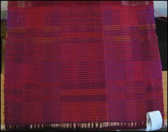
I am feeling tenuously happy with what is going on. But there is nothing like a photo to point up problems.
In the photo, the piece breaks into two parts along the warp. On the right, things tend to be a bit cherry and on the left they tend to be red. The right side also appears paler than the left side. And there is a clear visible line that separates the two sides.
DIFFERENT REDS IN THE WARP
The cause of all of this is that there are different reds in the warp ends. If you go here, you can see the two different reds I used for the warp. The colors don't look very different. One is slightly more cherry than the other and perhaps a tad lighter as well. But you have to study the cones to see the differences.
And if you check the pictures of the warp being wound on, which are here, there seems to be no difference at all. In fact, I wondered why I went to the bother of trying to distribute the colors in groups across the warp. What differences there were were so subtle as to be virtually invisible.
Or so I thought.
Once the weaving started, the differences made themselves known. Here is a photo of the bare warp ends as I was doing the hemstitching on this third piece:
The photo as a whole is a bit too bright and light, but it shows very clearly the distinctions in color.That lighter pink section on the right is precisely where the problem shows up in the weaving.
There are some lighter pink sections on the left, but they are smaller and more diffuse. They do not have the excessive impact on the woven cloth that the larger pink section on the right has.
But what about that dividing line? It is not just that there is a sharp division between the scarlet and the pink. There is one warp thread between those two sections that is just a tad lighter than the pink. Looking at the warp ends, I can barely tell that it is lighter. But once the weft is woven, the line screams out.
SOOO.....I HAVE LEARNED...........
- It takes only one warp end of a slightly different color to emphasize block divisions.
- I cannot be subtle in warp color changes in one area and very unsubtle in other areas.
- Colors on the cone and on the warp bundles can look very different when they are pulled taut on the loom.Technorati Tags: color
- Color changes in the warp need to be carefully thought out and planned even when the color changes are very small.
Addendum: the white thing in the bottom right hand corner is part of the white tape I use to measure the woven fabric. I have unpinned part of it and rolled it back so that it would not obscure so much of the photographed fabric.
© 2008


9 comments:
oh bummer, Peg. Was it not that noticeable to the human eye? It's still beautiful.
This is really quite fascinating. As a study in color I mean, and it's visual interactions and blending.
Lighter red aside, I think the more subtle use of yellow is much better.
Thanks too for the Technorati color tag link. Now I'm going to go add "color" as labels and del.icio.us tags to a few of my own posts!
Taueret, one thing that happens as I weave and dye is that my eyes grow more and more skillful at observing the subtle things. Clearly this skills are still developing!
Leigh,the Technorati color tag link was an accident. I couldn't find the labels place in my software, so I clicked on the tags and put in color. Then I saw that I only needed to scroll down the page to find the links. Glad you found it helpful but I don't understand......
Leigh, in fact I see no Technorati tag on the blog. So how do you know there is a tag?
And simultaneous contrast with the weft, perhaps. I love that you describe yourself as "tenuously happy" - I hope it's the happy that counts, Peg. I bet you're really loving every minute of it.
Meg, yes, I am loving every minute of this weaving, but it is a very tenuous and fragile love. I am afraid to blow it!
Good morning, Miss Peg,
Really love the look of the blocks on this piece. Nice blend of the organic and the architectural.
It really *is* amazing how one thread, or one slight difference in shade or tint can really be set off when things come together into the whole, isn't it? The colors are lovely, though.
I'm wondering if you could simply overdye that part of the piece (like warp painting) once it's off the loom to bring more continuity colorwise? Just a thought on more experimentation.
Weave on! These peices are great.
Jane
I've been giving this a lot of thought before I comment but... I definitely like the effect of the two slightly different reds! I can't decide whether it is the 3-d look or something else that I like about it, but it is something I associate more with painting than with textiles.
Jane, I am so pleased that you like the blend of architectural and organic--that is exactly what I am trying to achieve! No plans to overdye as I do not want to destroy the intensity of the reds.
Callybooker, thank you for mentioning painting in the context of my weaving. This particular crackle structure comes very close to working with some of the techniques of color-blending the impressionist painters used. Perhaps this is why I prefer a crackle kind of structure to tapestry.
Post a Comment