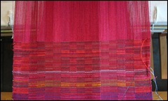
For this sample, instead of a point twill treadling, I tried an advancing twill treadling, using two colors. Here are the two samples I have done so far. They are separated by a faint blue weft. At the bottom is the point twill treadling I talked about last time. At the top is the is the advancing twill treadling.
When I blew up the image in the last post (by clicking on the image), the warp over shots were very clear. Blowing up this image also reveals warp over shots but they are not nearly as problematic. Actually, they look more problematic in the blow-up than they do in the fabric. In the fabric they simply add to the design element. At least that is my less-than-humble opinion.........
These little samples are really pieces to be enjoyed close up. I realized that before I posted the image, but seeing the actual image confirms it. Close-up is where the liveliness is. As you step away, they become rather dull. That suggests to me that if I were to weave an entire piece in this style, I would have to have an occasional spark that will attract the eye from a greater distance and invite the viewer to come closer. I have no idea at this point what that spark might be!
© 2008


2 comments:
Hi Peg, I see what you mean about the close up liveliness. That point about weaving a whole piece in this style has me thinking what a stunning fabric it would be for something wearable, getting more interesting to look at as the beholder gets closer. You'd have to be feeling in a sociable mood when you wore it ;)
As usual, I love your colours!
Nothing bashful about these colors, is there Dorothy?! Actually, I'm thinking of the possibility of pillows, though in other colors to go with our furniture.
Post a Comment