Posted by Peg in South Carolina
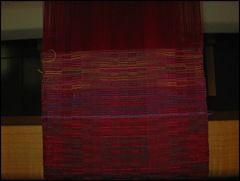
Here is the last bit of sampling I did. This is the weaving at the top, above the light blue line.
Here I used the point twill treadlings once again. In the first half (just above the blue line) I used three colors: orange, green, and blue. The blue and the green are so close in value, however, that the fabric reads as only two colors, blue and orange. And because of the warp colors, the orange tends to read as read rather than as orange.
I treadled three different sets of 3,4,5,6,7,8,7,6,5,6,7,8,7,6,5, 4,3,2,1,2,3,4,5,4,3. With each set I changed the color order.
For the second half, I did the identical treadlings but changed the colors. This time I used yellow, green and cherry. This I thought more interesting since all three colors are easily distinguishable with one color (yellow) being dominant. More interesting, however, does not necessarily mean better. In this case the look is rather messy.
All and all, this was kind of fun to do and a challenge to my ageing brain to keep the colors straight! But the results are not particularly pleasing to me. I won't really know, of course, until I see it again after a period of time when it comes off the loom. But for now I like the earlier two-color samples better. In the case of the first, the three colors do not read as three colors. In the second case, the three colors are just too busy. Perhaps if I treadled each group for several repeats, but I don't think so.
© 2008
Posted August 18, 2008 by http://talkingaboutweaving.blogspot.com/


3 comments:
Hi Peg,I finally have a moment to get to other weaving blogs. I appreciate the comments you leave on my blog. I will be putting a link to your informative blog up on my next posting. I love the colors you have been sampling. I bet they look even yummier in real life. The weave structure plays an interesting part in the optical color mix. Isn't that fun?! -Renee
Well, it may have been challenging, but the reward is an extremely visually interesting piece! But if you don't like it as well as the first ones, then there's the subjective element in action. You've got me thinking though, would it be possible to have certain areas which are busy with color? That may be too far-fetched, but then I haven't honestly studied design for weaving. Yet.
Renee, I don't know that they look "yummier" in real life, but they are definitely intended for close-up viewing. And yes, I am really enjoying working with using weaving structure for color effects.
Leigh, I don't think that "busy with color" is necessarily a bad thing---certainly Fassett's knitting and quilting are busy with color. The issue is the ability to control so that you don't have chaos. And I'm only going to learn that by continuing to work, work, work........!
Post a Comment