Posted by Peg in South Carolina
I have always been interested in, have always loved, color. But grayscale? I hate it. Why? Because I simply cannot judge the grayscale values of color, except in really extreme cases. But digital photography has made this a snap. Thanks to this technology I could take the colored photo and transform it into a grayscale version.
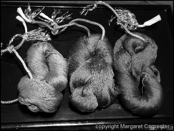
Grayscale version of the photo:
Having transformed the photo, thanks to Paint Shop Pro, I could see that the lime green was definitely lighter on the grayscale than the others. But, until I converted the image to grayscale, I would have guessed that it was a great deal lighter than either of the two other skeins. Not so. It is a great deal lighter than the skein on the right, but not so much lighter than the middle skein.
MUNSELL+DYE STUDY GROUP
I have Karren Brito’s new Weavolution group to thank for this helpful trick. Karren, an accomplished dyer, especially in using Lanasest/Sabraset dyes on silk, has started a new group there called the Munsell+Dye Study Group. If you go to the group’s Forum here, you will see the post and photo that inspired me.
By the way, Karren is also a weaver, a craft she has lately returned to. She has a web page/blog which she calls Entwinements. She also has a Facebook page, for anyone interested in social networking.
I am not, by the way, a member of Karren’s study group. By the time I learned about it, the group was closed. However, at Karren’s suggestion, I am now working on collecting names for a second group. If you are interested, go the Munsell+Dye Study Group on Weavolution and either post your interest on that group’s forum (you will see the appropriate topic there) or send me a PM.
So now I have a new tool to help me judge colors, the placement of colors, and the amount of colors in weaving piece I am designing.
“Gray Scale and Color” was written by Margaret Carpenter for Talking about Weaving and was originally posted on July 20, 2010. ©2010 Margaret Carpenter aka Peg in South Carolina.

