Showing posts with label computer art. Show all posts

Thursday, June 11, 2009

DESIGNING THE MIDDLE SECTION

Posted by Peg in South Carolina

I am getting close to the middle section of this sample/scarf that is on my loom.  But I have not yet designed it.  All I know is that I want to use treadlings from both of the previous two design groups, combining them in some way.

To help me design this section, I needed to see together those two motif sections I had woven.  With the scarf still on the loom, that was pretty much impossible.

So I went into Paint Shop Pro and created the following image:

Motifs 1 and 2 juxtaposed

I even managed to label the treadles to make it easier to work with.  I have printed this out.  In black and white since all I have is a laser black-and-white printer.  But the contrasts are clear and that is what matters.

I am so pleased with the results of my efforts that I find myself staring at the photo with cat-like pleasure. I cannot even bring myself to work on the designing---the very reason for going through this work!

I am definitely no longer “distracted and out of sorts.”

Related Posts:  
   Motif Stripe 2
   Figure and Ground

image


Designing the Middle Section” was written by Margaret Carpenter for Talking about Weaving and was originally posted on June 11, 2009. ©2009 Margaret Carpenter aka Peg in South Carolina

Wednesday, May 13, 2009

DESIGNING THE SCARF

Posted by Peg in South Carolina

I decided I needed some visual concept of the overall scarf before I began weaving it. Not the details; just a general layout. I had never felt the need for to do this before. But also this is probably the most complex design I have ever tried to develop. I wonder how keeping my E-sketchbook has played into this new development.

DESIGNING IN PAINT SHOP PRO

2 scarf layout I opened Paint Shop Pro and did some playing. The yellow marks, which are just erratic dashes, represent the motif designs, their general idea, not how they will appear in fact.

The design on the right is the first one I came up with. It’s a symmetrical design. OK, but boring.

So I came up with the design on the left. Still symmetric, but some changes. The solid red spaces are all the same size. Well, they are supposed to be. My “drawing,” despite using the ruler PSP offers, was a bit slapdash. But the motif designs have changed.

CHANGE IN MOTIF DESIGNS

  • I have added the blue shadow crackle on either side of each motif. That is represented by the erratic blue dashes.
  • Then I have changed the sizing of the designs. The center design is twice the length of the others. This gives a focus.

So now I have a sense of the overall design. Once I have figured out the actual sizes, I can start weaving and work on the details as I weave.

SOME DESIGN DETAILS

  • Working out each design, both pattern and color
  • Creating ways to make the background look interesting without overpowering the major design elements

image

Related Posts:
Latest Entries in Sketchbook
Hot off the Loom and On To My Shoulders


Designing the Scarf” was written by Margaret Carpenter for Talking about Weaving and was originally posted on May 13, 2009. ©2009 Margaret Carpenter aka Peg in South Carolina

Wednesday, March 25, 2009

BLOGS TO VISIT

Posted by Peg in South Carolina

My New Cone Winder – Woven’N’Spun

An ingenious way of using a bobbin winder and a foam cone to wind yarn onto a cone.  The only thing she forgets to say is that the yarn must be wound moving rapidly up and down, crisscrossing the cone. This way, layers of yarn don’t dig into earlier layers of yarn and the whole thing will unwind smoothly. 

If you spindle spin, you will recognize this as the way you wind the spun yarn onto the spindle. 

If  you spin on a wheel with a WooLee Winder, it winds the spun yarn on in the same way which is why those bobbins are wound much tighter and firmer that on wheels without WooLee Winders.

Woven Ratios an essay by Barbara Walker on WeaveZine.

This piece really appealed to me because it is about a weaving technique I have been playing with (in my head) and thinking about as a good way to use my hand spun yarn.  The weaving technique is called color-and-weave, but what is different about Walker’s piece is that she analyzes how to use color in terms of intensity or strength and proportion when developing a color and weave drawdown. 

Her discussion of color is applicable to weaving structures in general. 

When she discusses intensity, she is not so interested in the varying intensities a single color can have, but a comparison of the intensities of the different hues.  This is because she is interested in teaching how one can successfully use two different hues which seem quite strident by getting the proportions right in terms of the amount of each hue that is used.

Temples…love ‘em or hate ‘em – Dust Bunnies Under My Loom

I have not been using temples lately.  Lynnette has reminded me how useful they can be.  For those who don’t really know how to use this tool, do check out her post.

Imaging Weaves – Curiousweaver

A very interesting post on fashion drawing.  In her discussion she gives a link to a fascinating download of fashion templates.  I intend on downloading it. 

mannequin Meanwhile, I have tried my own experiment by copying and pasting a Vogue pattern image into Paint Shop Pro and playing with it.   It would be hard to draw a scarf on it with a mouse and I don’t have a Wacom tablet


Blogs to Visit” was written by Margaret Carpenter for Talking about Weaving and was originally posted on March 25, 2009. ©2009 Margaret Carpenter aka Peg in South Carolina

Monday, January 19, 2009

PLAYING WITH COLOR

Posted by Peg in South Carolina

Burnt oranges

A book I recently purchased is called Confident Color: An Artist’s Guide to Harmony, Contrast and Unity, by Nita Leland. I have enjoyed her earlier work and now am finding this book to be quite interesting. Or at least I find that it stimulates my thinking about what I might do with color in weaving. It is probably the photos in the book that are most important, but they are in the context of commentary, which is also helpful.

The picture at the top of this post I created in Paint Shop Pro, using a picture on page 44 as my inspiration. I used two processes. First I created the various squares and rectangles (but not the yellow not the little red square at the top right) with the rectangle tool and filled them with various colors using the flood fill tool. Then I did some blurring and applied some filters. Last I put in the yellow thin rectangle with its square at the end and then the dark red tiny little square at the top.

What is here is far less subtle than what is in the inspiring photo, but it gives me the general idea. The major issue, which I see only now since I have inserted it into this post, is that the yellow line should be farther down. There should also be a bit more pure black.

Despite the limitations of this interpretation, I still like it and think it would be possible to create a piece based on this idea. Not a literal interpretation, any more than this is a literal interpretation of the piece in Leland’s book.

What I am taken with is the use and placement of yellow and dark red. It could work in an art piece, but I think it could also work in fabric meant to be worn or used in furnishing. That would require repetition. But I would like to try it with crackle and see what I can do.

Here is one attempt with my weaving software:

Crackle interpretation

The visual effect is far too much of a plaid and also the background colors are too spotty. The only colors which I want to stand out sharply are the black warp stripes and the bright red and yellow weft stripes. It is difficult for me to get this in the weaving software. But I could do better.

Of course, I have some other irons in the fire to deal with first.


"Playing with Color" was written by Margaret Carpenter for Talking about Weaving and was originally posted on January 19, 2009. ©2009 Margaret Carpenter aka Peg in South Carolina

Wednesday, October 8, 2008

PIXELOOM, PAINT SHOP PRO AND GRADATED WARPS

Posted by Peg in South Carolina

Tien recently blogged how she combined her graphics program and her weaving program in order to get an idea of what the final woven product would look like. In her post, Some Color Mixing Surprises, she shows the latest of her experiments. In her post Photoshop Tricks, she gives some of the details of how she did it using Photoshop and Fiberworks PCW.

My graphics program is Paint Shop Pro XI. My weaving program is PixeLoom. Could I do the same thing? The answer is, yes, but not in quite the same way. That is to be expected considering Tien and I are using different programs.

First I opened PixeLoom and created a simple pointed twill, tromped as writ. original drawdown in PixeLoom
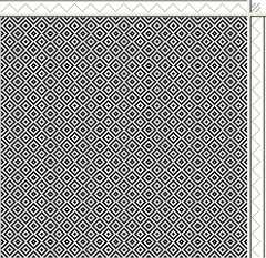
Here it is reduced in scale. The white is the warp; the black is the weft.

I then used my SnagIt screen capture program to copy and paste it as a new image into first step Paint Shop Pro. You can see that this image is not reduced in scale as much as the first image. I tried to find the size that would best create a good final image.
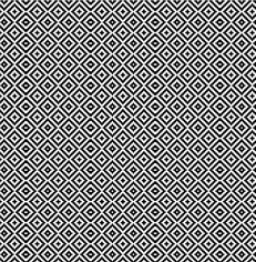
Like Photoshop, Paint Shop Pro has a magic wand selection tool. I used that to select the black areas (the weft). I copied the resulting image to the clipboard.

I then created a new image in Paint Shop Pro and filled it with a gradient. Gradient on twill I pasted the image I had copied into this new gradient-filled image; I copied it specifically as a transparent selection. And here is what I got. Pretty cool!
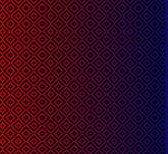
I could do the same thing using only PixeLoom. But that would mean painstakingly selecting colors warp end by warp end. This is much faster. It is also much easier to play with the gradient, changing it till you get what you like.

I could use this same procedure for warp stripes. Instead of using the gradient feature of the program I would create stripes the color I wanted and the width I wanted. Again, these would be easy to change and play with until I got the effect I wanted.

Where, however, I think this process would really shine is with warp horizontal gradient painting and even ikat. If I wanted to do a gradated warp, for example, I would create the gradient as a horizontal gradient instead of a vertical one.
If I wanted to do this with a painted warp rather than with a gradated warp cross wise, you can just make my gradation horizontal instead of vertical. Here I have created a horizontal gradient but have not copied the drawdown onto it.

I could also design a painted warp or ikat warp, by using a (computer) paintbrush to paint that image just the way I wanted it before I copied the drawdown on it. And I could also just play with all the design/color effects the graphics program offers me. In which case I might never get anything else done!

I can also change the color(s) of the weft yarns.

Would this work in the complicated kind of weaving I am doing? I’m skeptical. To make it work at all would, I suspect, require a lot more work. At some point, now that I now what I am doing, I will try it just to see.

P.S.

These graphics programs cost money, thought Paint Shop Pro is much less expensive than Photoshop. But there is a nifty free graphics program with all the power of these two programs. It’s called The Gimp. Like the other two programs, it takes awhile to learn. But there are books, online tutorials, forums and email lists for support.

The program is open source software. I am all for open source and so have been tempted to download it. Perhaps the next time Paint Shop Pro has an upgrade I will consider moving to the Gimp.

Also, you can use your free Print Screen on your keyboard to copy what is on the screen. But I find Snagit so useful for all sorts of things that I think it is worth the money to have.


Related Post: Colors for Silk Crackle Warp


"PixeLoom, Paint Shop Pro and Gradated Warps" was written by Margaret Carpenter for Talking about Weaving and was originally posted on October 7, 2008. © 2008 Margaret Carpenter aka Peg in South Carolina

Friday, November 2, 2007

Colors for Silk Crackle Warp


This is a picture of the colors I am thinking of using on the next silk crackle warp. On the left are two versions of the major color: blue. Then there is a series of neutrals which will make up the greatest area. And the last two colors are sparks that will be used much less frequently. Also, I want to work in a tiny bit of black.

The colors here come from the yarn wrappings I made from the dye samples. I have a screen capture program called Snag-It. I went to the photos of the yarn wrappings and used Snag-It to capture each of the colors I wanted. Each color I captured I pasted into a Word Perfect document. When I was done, I could manipulate each capture to get the size I wanted and arrange it on the page where I wanted. When I had them all lined up the way I wanted them and the size I wanted them, I used Snag-It to capture the group and saved it as a png file. It is that png file that is the picture at the top of the page.

The colors are relatively accurate. But what I like about the resulting montage is the lack of flatness in the colors. If I had simply pulled pure colors out of Paint Shop Pro and created a montage like that above, the colors might have been "prettier" but they would have lacked the interest that the yarns show.

I had fun doing this (maybe too much fun?!). I could play with the arrangement by changing the proportions. I could make copies of some of the colors and add them to the montage. I could create a picture of what I would like the entire width of the warp to look like. I could change the png file to a PaintShopPro file and play with it there. I could try some of the neat stuff that Karen Madigan has done. One example is here. But check elsewhere in her blog for other neat stuff she had done with computer software.

I am too easily seduced by the computer.